
NATIONAL TRUST REBRAND
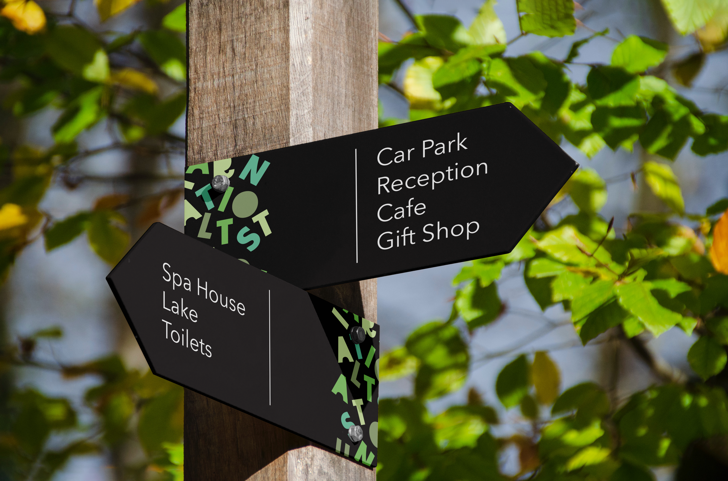
Wayfinding Design to be placed around various National Trust sites and landmarks.
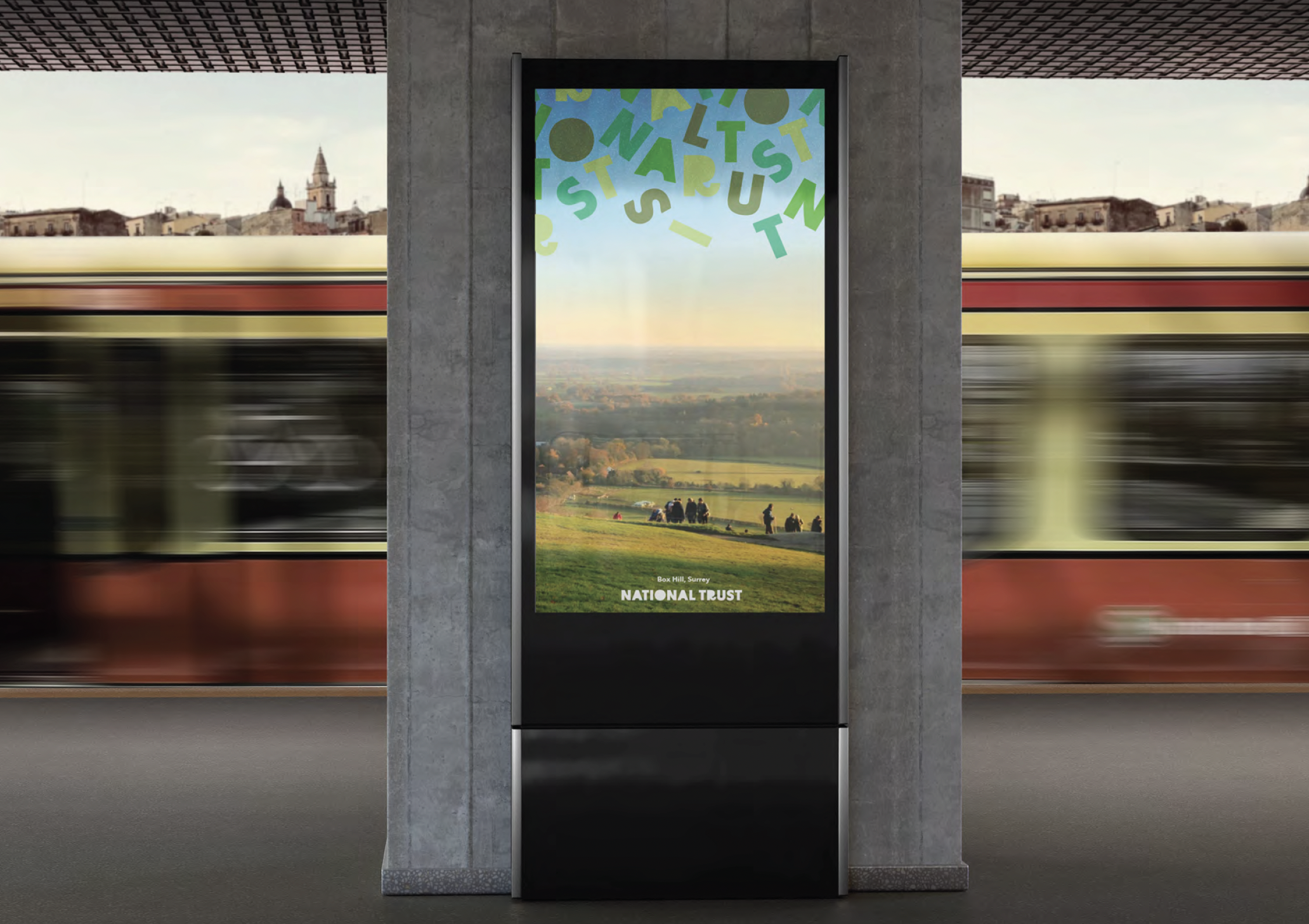

Print and Digital Poster concepts.
The rebrand uses carefully reconstructed letters from the ‘BD Supper’ font family paired with ‘Avenir Light’ to create a playful, modern approach to nature.
The colour scheme is solely greens because the different shades can be used to replace the typical blacks and whites. For example, a dark green body text or header on top of a mint green background can give the same level of clarity. However, black and white can be seen throughout the touchpoints to create contrast.
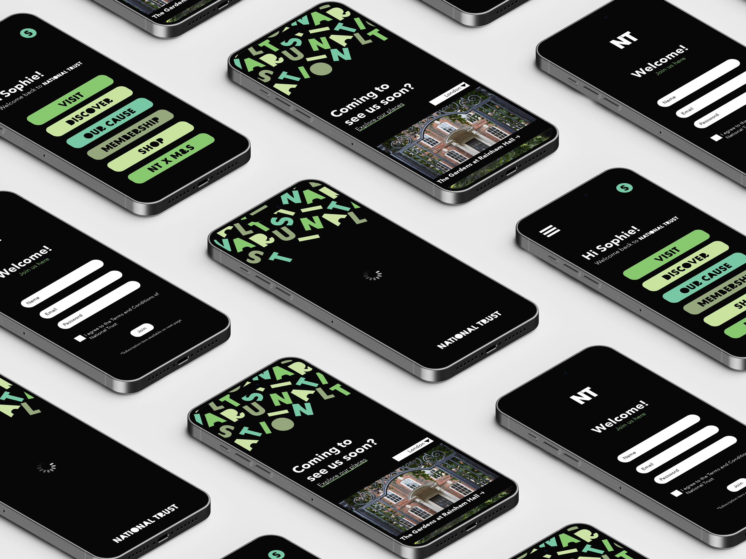
App Mockup.
This was the first project I did where I really dived deep in to the world of UI & UX. Using Adobe XD to create a series of pages showing the user experience through the app, this launches the National Trust in to the new generation.
I used a series of elements to create a smooth experience, including rounded edges and a personal tone of voice.
Next steps are to use After Effects to animate the jumbled text, falling from the top of the loading screen to the bottom, revealing the log in/home page.
Other Work
A brief set by Frog to rebrand the National Trust for a Gen Z audience. This project enabled me to pitch to the agency in person and elaborate my ideas based on real life industry feedback. I took a hands on approach to the brief by choosing type that was the opposite to the National Trust’s classical feel. The type is inspired by the scattering effect of nature and how messy it can be.

TORTUGA

Umbrella Connection