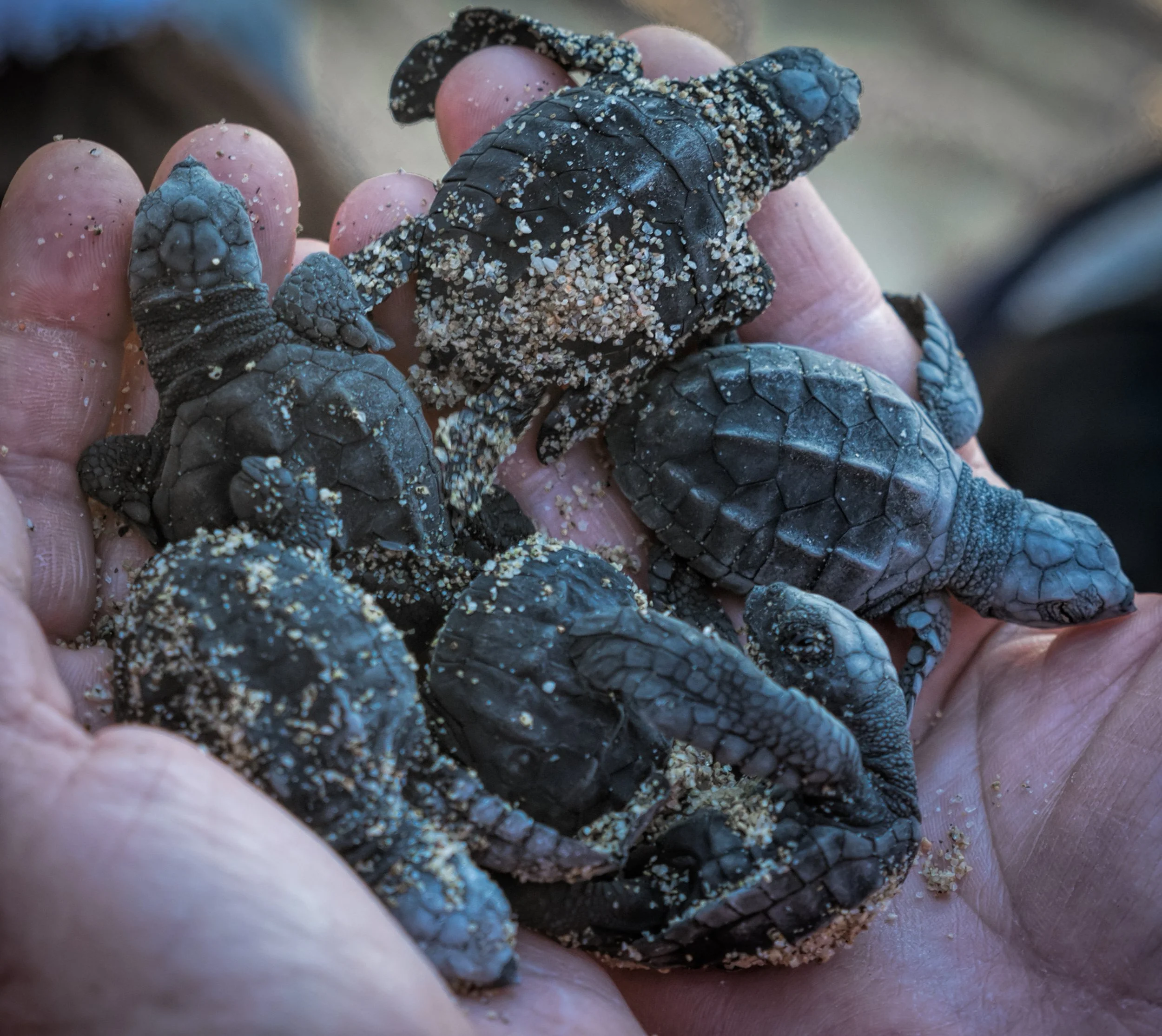
TORTUGA
A competition brief set by Brand Opus to create a spirit brand with strong roots to its place of origin. TORTUGA is a rum brand from Costa Rica that helps to protect sea turtles from poachers. ‘Tortuga’, meaning ‘turtle’ in Spanish, donates 50% of profits to their conservation. Experimenting with type and imagery, this simplistic, meaningful brand helps consumers to feel the difference they are making with every sip.
Wordmark Animation.


Brand Assets / Social Media grid post.
UI/UX- Website Design.
Supporting the vision for a luxury drinking experience, the website for TORTUGA follows through. It is split in to sections of information making it an easy user experience.


I created this brand after researching what issues there are yet to be resolved in South America. Using typical beach colours, the brand identity represents the colours of the ocean as well as promoting a luxury drinking experience.
The bottle design itself is very basic and plain, because the main focus of the brand is for drinkers to recognise the good they are doing by supporting the brands mission, instead of focusing on an aesthetic bottle.
The word mark stretches across the bottle, making it good looking at any angle it is placed down at.
TORTUGA Rum bottle design.


Brand Assets.
Other Work

National Trust Rebrand

Umbrella Connection